Plotting your data#
Once you have run your workflow, you will likely want to visualise the output data. There are several ways you can do this. Here we cover two methods: using terminal GUI tools and using Python with the Iris library.
Using GUI tools#
For quick visualisation and inspection of NetCDF data files, you can use graphical tools such as ncview and xconv. These tools provide a fast way to explore datasets without writing any code, making them useful for checking file contents, verifying dimensions, and performing an initial quality check before more detailed analysis.
Running graphical applications over SSH
If you are connected to a remote system over SSH, graphical applications need X11 forwarding to display on your computer. Start an X server on your computer first (for example, XQuartz on macOS), then connect from a terminal using generic host details supplied by your service:
ssh -AY <remote-host>
Repeat the options for every additional SSH hop. The -Y option enables
trusted X11 forwarding. The -A option forwards your SSH authentication
agent and should only be used with systems you trust. A terminal integrated
into an editor such as VS Code works in the same way as any other terminal.
On the system where you will start the graphical application, run
echo "$DISPLAY". It should return a value. If it is blank, disconnect
and reconnect with X11 forwarding enabled at every hop before continuing.
ncview#
ncview is a lightweight graphical browser for NetCDF files. It can display
2D fields, animate data through time, inspect values, and switch between
variables and dimensions. It is particularly useful for obtaining a quick
overview of model output or observational datasets.
Example:
ncview temperature.nc
See also
For help choosing the correct Monsoon3 service and finding the official setup guidance, see Using Monsoon3.
ncview temperature.nc
Note
“Other” means your own machine, or a system run by another institution. You provide the environment yourself. See Choosing your platform.
ncview temperature.nc
Useful tasks include:
Browsing available variables in a file
Stepping through time slices
Viewing simple animations
Examining data ranges and missing values
Documentation and setup:
ncview documentation: https://cirrus.ucsd.edu/ncview/
xconv#
xconv is a graphical data exploration and conversion tool commonly used
within the atmospheric and climate modelling community. It supports NetCDF
files as well as several meteorological data formats and provides facilities
for plotting, inspecting dimensions, and converting data between formats.
Example:
xconv
xconv
Note
“Other” means your own machine, or a system run by another institution. You provide the environment yourself. See Choosing your platform.
xconv
After launching the application:
Open a NetCDF file.
Select a variable from the variable list.
Use Plot Data to display the selected field.
Navigate dimensions such as time, level, latitude, and longitude using the GUI controls.
Documentation and setup:
xconv documentation: https://ncas-cms.github.io/xconv-doc/html/index.html
xconv setup guide: https://ncas-cms.github.io/xconv-doc/html/setup.html
When should I use GUI tools?#
GUI tools are ideal for:
Quickly checking that a file contains the expected variables
Exploring dimensions and metadata
Verifying model output before analysis
Performing a rapid visual quality-control check
For reproducible analysis, processing large datasets, or creating publication-quality figures, command-line tools and scripting languages such as Python are generally more appropriate.
If these tools are installed via environment modules on your system, you may first need to load them before use:
module load ncview
module load xconv
module load ncview
module load xconv
Note
“Other” means your own machine, or a system run by another institution. You provide the environment yourself. See Choosing your platform.
Install ncview and xconv yourself, or use the Python route
below instead.
Refer to your local HPC documentation for the exact module names available on your platform.
Using Python#
The output files are in NetCDF format, which can be read using a variety of software packages. Python provides more flexibility and allows for more complex visualisations. Below is an example of how to read and plot NetCDF data using the Iris and Matplotlib libraries.
import os
from pathlib import Path

import iris
import iris.quickplot as qplt
import matplotlib.pyplot as plt

# Set the path to the data.
path_to_data = Path("path/to/your/data")

# List what that path contains (up to 10 files).
print(os.listdir(path_to_data)[:10])

# Load one output file to inspect available cubes.
print(iris.load(path_to_data / "data_file.pp"))

# Load a cube from a NetCDF file.
surface_temperature_cube = iris.load_cube(
    path_to_data / "output_file.nc", "surface_temperature"
)

# Change the units from Kelvin to Celsius.
surface_temperature_cube.convert_units("celsius")

# Choose the time slice to plot (e.g. the first time slice).
time_slice = 0

# Plot the data.
qplt.contourf(surface_temperature_cube[time_slice, :, :])
plt.gca().coastlines()
plt.show()
The resulting plot can be seen below.
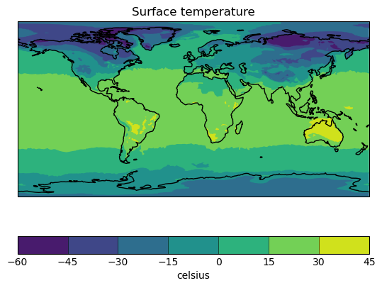
Fig. 27 Example output from iris.quickplot.#